Newsletter Sign-Up
Loading...
Close

FT Magazine and Edward Tufte

July 29, 2013

The July 26 Edition of FT Magazine is devoted to Graphics and includes a brief interview with Edward Tufte.  Tufte is the inventor of the Sparkline chart which has become ubiquitous in the financial reporting world.  Tufte is also famous for his condemnation of PowerPoint and his examination of the presentation software’s role in the Challenger and Columbia disasters.  Tufte’s one day seminar is near the top of my bucket list.

Influ-Venn-Za or why I love Venn diagrams

July 17, 2013

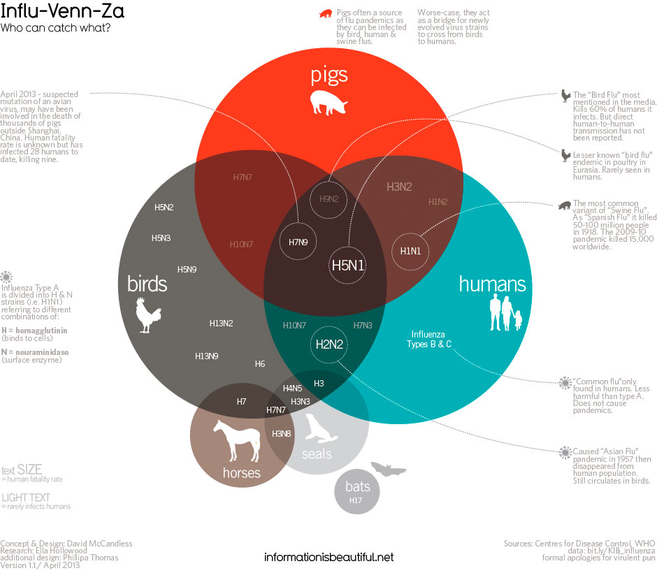
Flu season will be upon us beginning in the next few months.  Its not just for humans, you know.  From The Guardian, a venn diagram identifying the enemy strains and their targets.

Information is Beautiful on influenza

In Praise of William Playfair

July 14, 2013

We live in the time of “big data.”  We struggle to develop unique formats and methods to allow us to digest and utilize the data we capture.  This section of Pindropllc.com will be devoted to examining interesting and useful methods of displaying quantitative information to enhance understanding of a variety of topics.

This “Infographic” section of Pindropllc.com pays homage to William Playfair.  Born in 1759, Playfair was a less than successful renaissance man of the Enlightenment. His endeavors ranged from silversmith, apprentice to Watt and Meikle, economist, draftsman, engineer, etc.  He was also a bankrupt, blackmailer, speculator, convict and journalist.

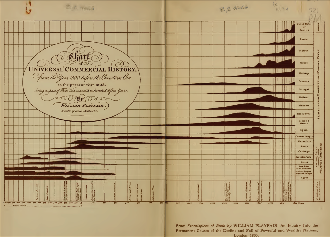
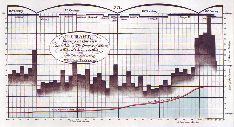
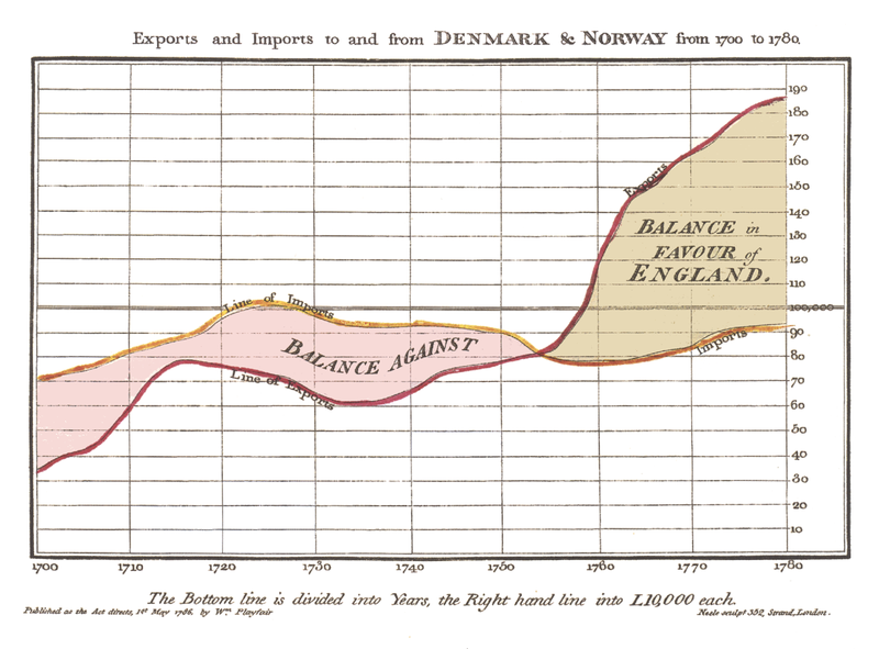
However, Playfair made an enduring contribution to our cognitive ability to understand the world around us.  He “invented” the first line-graph, bar-graph and pie-chart.  Here are examples of his work (click on chart to enlarge).

william_playfair_universal Playfair1 800px-Playfair_TimeSeries-2

Another Scary Unemployment Chart

July 12, 2013

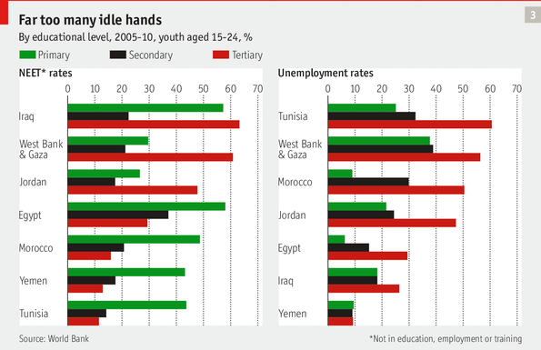
This week’sThe Economist’s special report on the Arab Spring contains another scary chart of youth unemployment throughout the Levant, North Africa and the Middle East courtesy of the World Bank.  Most shocking is that the highest rates of unemployment are among middle class aspiring youth with tertiary education levels.

Economist Unemployment Chart

Scariest Unemployment Charts

May 1, 2013

The Atlantic calls these the “scariest unemployment charts” you well ever see.  I find this even more frightening:

post-img

European youth unemployment is above 50% in Greece and Spain and above 20% in the major European countries with the exception of Germany.  Should be quite a summer in Europe!

Newsletter

Loading...